First off is the DPI. I use 300 because that gives the most definition when the image is shrunk later compared to the amount of time taken to go higher. If I used 600 it would take 4 times as long to scan each page, and much longer to work with on the graphics editor as the file would be so large.
With the next few pictures I'll show how a scan can be improved. I've shrunk the images for this, the originals are around 2500 pixels wide

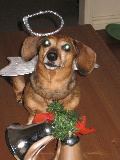
#1 - this is the raw scan as it was taken in.

#2 - the first step after scanning is to align the image. I do this before resizing because the greater the size of the original when editing, the better the final result later. In this case I rotated the image 1 degree to the right. It's very rare that you'll need to go over 1 degree in rotation either way if you align the image fairly well in the scanner before scanning. Usually I find that rotation is around 0.3 to 0.5 degrees.
After rotating to the correct position - you will usually find a straight line on the page that you can use as a ruler - the next step is cropping.

#3 - this is the image after it's been rotated and cropped. As you'll see, it now looks correct in alignment and setting, image quality comes in later. When cropping I try to not include more than is absolutely necessary in order to make the final image clearer, so don't be shy about margins.
At that point I resize the image - for most things I set them as 800 wide, though you should change this depending on the size of the text in the scan and in what method you'll be using the final image.

#4 - this is the image after i've adjusted the brightness and contrast. Using PaintShop, the settings for this were : brightness + 53%. contrast + 33%. The brightness level is fairly intuitive, while the contrast level was based on looking at a white area. As I adjusted upwards I checked to see when greys became white and stopped there. You should note how the bleed-through from the other side of the page (that can be seen in step #1) is now gone.

#5 - this is the final step - sharpening. It's not too clear in this example, but for text, the most important part in scanning this type of matter, it really does define things better. You might notice the difference in teeth and jewellery in this example...
Most scanner packages contain software that does the things I've mentioned here, so it shouldn't be too difficult to apply those ideas. But if you've any questions, feel free to ask.