
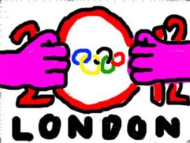
It took me ages to realize that it's supposed to be:
2 0
1 2
It's a pretty bad design if it takes a doofus like me that long to "see" it.
London 2012 Olympics
-
girldorksrule

- Arrrrrrr...scurvy!
- Posts: 1172
- Joined: Tue Jun 13, 2006 4:19 pm
- Location: Walkin' the plank


seems like its just not the couch that doesnt like it.
LONDON (AFP) - The "iconic" logo for the 2012 London Olympics was unveiled here on Monday, but critics immediately condemned it as "hideous" and a waste of money. The jagged emblem, designed to define the image of the Games in five years' time, comes in a series of bright shades of pink, blue, green and orange, and includes the signature five Olympic rings emblazoned onto the "0".
"This is the vision at the very heart of our brand," said London 2012 organising committee chief Sebastian Coe, the former 800m and 1,500m world record holder who won gold in the 1,500 metres at the 1980 and 1984 Olympics.
"It will define the venues we build and the Games we hold, and act as a reminder of our promise to use the Olympic spirit to inspire everyone and reach out to young people around the world," he said at the London launch Organisers hope the logo, designed to be instantly recognisable worldwide, will help boost its campaign to raise two billion pounds to stage the Games.
"This is an iconic brand that sums up what London 2012 is all about -- an inclusive, welcoming and diverse Games that involves the whole country," said Olympics minister Tessa Jowell.
But critics were not impressed.
Bob Neill, 2012 Olympics spokesman for the main opposition Conservative Party, was disparaging about Coe's optimism, despite him being a fellow Tory lawmaker.
"Lord Coe has described this logo as 'ambitious, interactive and youth-friendly'. I would describe it as hideous," he said.
"Questions need be answered as to how we have ended up in this situation. Was there an open competition to supply the designs? If so, what on earth do the rejected ones look like!
"We need to know how much money this exercise has cost, because whatever it was, it's been a complete waste of money."
Initial public reaction was also less than positive.
"This logo makes me embarrassed to be English," said a contributor called Clumbers on one online message site devoted to the logo, which was devoid of supporters of the chosen design.
"It looks like it could have been done by a six year old. I could do better with my eyes closed," added someone called Bige.
A poll by the BBC News website asked readers to give it a gold, silver or bronze medal, or a wooden spoon if they really didn't like it. Eighty three percent gave it a wooden spoon.
The budget for the 2012 Olympics has soared to 9.3 billion pounds, nearly four times more than the first projections of how much it would cost to stage the Games in London.


-
Brown Sauce

- admin
- Posts: 1426
- Joined: Sun Jan 07, 2007 3:40 pm
Does this say anything to anyone ? If it does it's very, very funny. If not it's almost as obscure as the 400 grands w'th.
well done "sean stayte".
if it say's nothing https://en.wikipedia.org/wiki/Goatse.cx
well done "sean stayte".
if it say's nothing https://en.wikipedia.org/wiki/Goatse.cx
-
eefanincan

- Admin
- Posts: 6627
- Joined: Sat Apr 29, 2006 5:05 pm
- Location: Canada

I didn't see that bit about Goatse until after I saw what you meant - haha excellentBrown Sauce wrote:if it say's nothing https://en.wikipedia.org/wiki/Goatse.cx
Brown Sauce wrote:if it say's nothing https://en.wikipedia.org/wiki/Goatse.cx
The second I saw that I thought, goatse!
[align=center]
London 2012 Olympics: Trafalgar Square countdown clock stops
Omega has sent a team of technicians to Trafalgar Square after its clock, counting down the 500 days until the opening ceremony of the London 2012 Olympic Games, stopped prematurely.
15 Mar 2011[/align]
The Olympics countdown clock, unveiled in the square with much fanfare on Monday night, stopped at 500 days, seven hours, six minutes, 56 seconds. A spokesperson from Omega said: "We are obviously very disappointed that the clock has suffered this technical issue. The Omega London 2012 countdown clock was developed by our experts and fully tested ahead of the launch in Trafalgar Square. We are currently looking into why this happened and expect to have the clock functioning as normal as soon as possible."
Measuring 6.5 metres tall and five metres long, the digital display intended to count down the days, hours and minutes in the same square where Londoners gathered in 2005 to hear their city announced as winning bidders. According to the Olympics organisers, the design of the clock reflects the look they want for the Games. The beams of light on the clock are intended to reflect London's connection with the Meridian line in Greenwich, "the home of time", an embarrassing claim given today's events.
On Monday, Lord Sebastian Coe, London organising committee chairman, said the clock would be "a daily and hourly reminder to everyone who visits Trafalgar Square that the countdown to the start of London 2012 has well and truly begun". Right now the clock serves as very real reminder to Locog – and Omega – that the next 500 days will be fraught with potentially embarrassing incidents.
-----------------------